My Name Is…
You may also like:
August 2015: My work in technology support requires me to make mayday calls to network, server and software vendors. So much of the time I’m on the phone providing information such as serial numbers, model numbers, product numbers, etcera, using the military phonetic alphabet. Interestingly enough, the toughest item that the phone analyst runs into with my phone calls is the spelling of my name.
My name is a pretty simple one in fact. It’s Davida. So I just say “Spell out David, and then add an A”. But 9 out of 10 times, this spelling tip just does not work for most. Many continue scratching their heads in confusion. So I spell out the D-A-V-I-D-A instead.
“So that’s ‘T-A-B-I-T-A’?’
Uhm, no.
My shortname (or nickname, if you will) is troublesome for folks as well. Naturally, people think that it would of course be shortened to “Davy” (really?). Or “Dee”.
Nope.
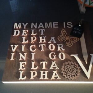
So one day, as I was spelling my name on the phone using the universally known and accepted phonetic alphabet, I thought of making a “My name is…” sign.
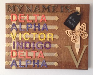
My name is…
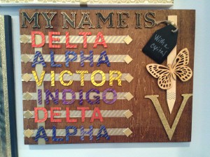
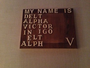
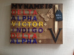
Delta|Alpha|Victor|Indigo|Delta|Alpha…
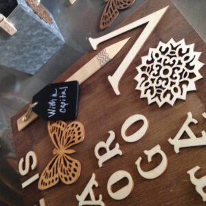
…with a capital “V“.
The V is the initial for my shortname used by my family and friends – Vida. 🙂
The idea came to me in a flash. But a workable vision and design for the sign did not come as quickly. I couldn’t decide whether it would go on canvas or on wood. Whether to do an ink transfer, paint, stamp pad, or wood letters. Or whether to do a wall hanging or something on a smaller scale (such as a desk accessory).
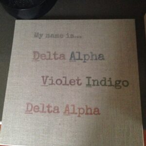
After days went by, I tried an ink transfer to a linen panel.
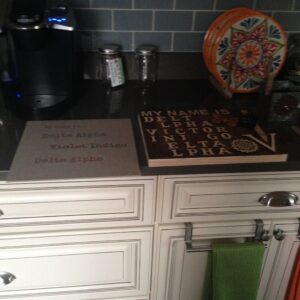
Mmmm…I knew I didn’t like where that was going, so I abandoned the design mid-project (and eventually re-used the panel for my octagon cork project).
I settled on a wood panel canvas because I already had a stained 11 x 14 panel ready to go from the Bruce Birthday 2015 gift project (which got “booted” in favor of another smaller, deeper panel). This panel I purchased from Blick (the same ones used for the Bed Stuy Wood Map Project).
I decided to use wood letters to spell out each word, and to use washi tape for decoration and embellishment.
I already had all the supplies I needed – Handmade Modern wood letters from Target. My Paper Source diagonal stripped gold washi tape. And my hot glue gun (with plenty of glue sticks),
Then came the real work – designing the layout for the piece.
Like a puzzle, I arrange and re-arranged the letters. I would run out of letters (and thereby run out to the Target to get more).
I would fret about what tape to use (and how to highlight the first letter of each word to spell out my name).
I obsessed over the size, the location and the placement of the “capital V”.
It took me days to figure out the design and layout. Yes days! I would arrange letters in the morning before work, then place the mock-up carefully on top of the fridge and ask Bruce to please not touch my masterpiece in progress (which earned me confused frowns in response).
It was around week three when I figured out the layout that worked best, After a big sigh of relief, I then had to tackle the question of colors.
Oh boy,,,here we go again.
I put the project down for a while and worked on others. After a couple more weeks, I decided to designate a Saturday and focus on getting the piece completed once and for all.
Colors
I decided to forgo using acrylic paint for the wood letters. I wanted bolder and brighter pops of colors against the stained wood (Early American). So I chose to use my Sharpie 8ct marker set as my coloring tool. I love using Sharpies to color my projects (and they make the wood letters look especially nice). It adds a special handmade flair to my projects.
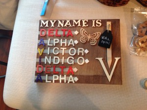
I used contrasting colors for each word in my name spelling. The “Deltas” are orange. The “Alphas” are blue. “Victor” is yellow. “Indigo” is purple. (Well, I suppose it should have been made blue, but this is the way the cookie crumbled in my color palette.
My first few test letters looked a bit one dimensional against the wood (even with the bright marker colors). So I used a Sharpie gold metallic pen to draw diagonal stripes over the base marker color. Adding that touch of metallic gave each letter the sparkle I needed to dress up the rustic wood base.
The next decision point was the color scheme for the “My Name Is” letters. I went with the Handmade Modern Coal metallic paint initially, but, once again, looked a bit flat (especially with more colorful name spelling letters). So I snapped up the gold Sharpie again to outline each letter.
The biggest challenge for me in the project layout was the capital “V”. I first tried the coal metallic paint. Then diagonally striped gold marker lines to accent it. I didn’t like how either version came out.
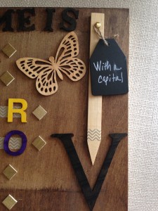
I finally went with a textured gold coat for the V. I used a large Sharpie gold paint marker and made “blot dots” over the entire surface of the V (which gave it that hammered texture). Beautiful.
Layout
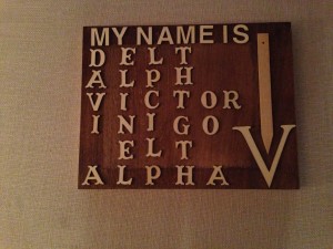
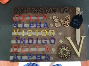
An herb wood stake served as my arrow (that points to the capital “V”). I used a bit of chevron gold washi tape at the tip to accent the stake and added a chalkboard tag that is anchored to the stake at the top using a brad. I hand wrote the words “And a capital” on the chalkboard using permanent chalkboard marker. I placed a wood butterfly to the stake (to add a pretty element to the capital “V” arrow).
To separate the letters of my name from the capital V, I added bands of used the diagonal gold washi tape on the left and positioned the letters across each strip. The diamonds on each side of each word are little wood squares that I painted gold using the Sharpie paint marker.
And, for the D-A-V-I-D-A, I added a subtle distinguishing visual touch by placing a vertical solid gold strip of washi tape as a background for each letter.
Hot glue was used to affix each element to the wood canvas, bringing my slowly developing vision to life.
Slow journey to completion
This project was truly an organic one that went through many stages and constant changes from start to finish. Other than the extra box of letters I needed to buy mid-project, I had everything I needed in my existing (and growing) supply of craft tools. When I start and complete a project using the supplies I already have, it quickly becomes one of my favorite creations (whether simple or elaborate).
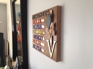
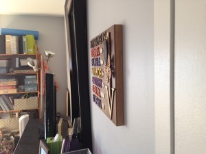
I absolute love the way this project came out. It’s not perfect by any means (but my favorite crafts rarely are). I smile as I look at the gold highlights from the tape and each letter (made more brilliant from the light of the sun or from the evening glow of our living room lamps. And the painstaking process of designing and making the sign (along with the time, love and attention put into it) made it sparkle to my eyes even more. V-
