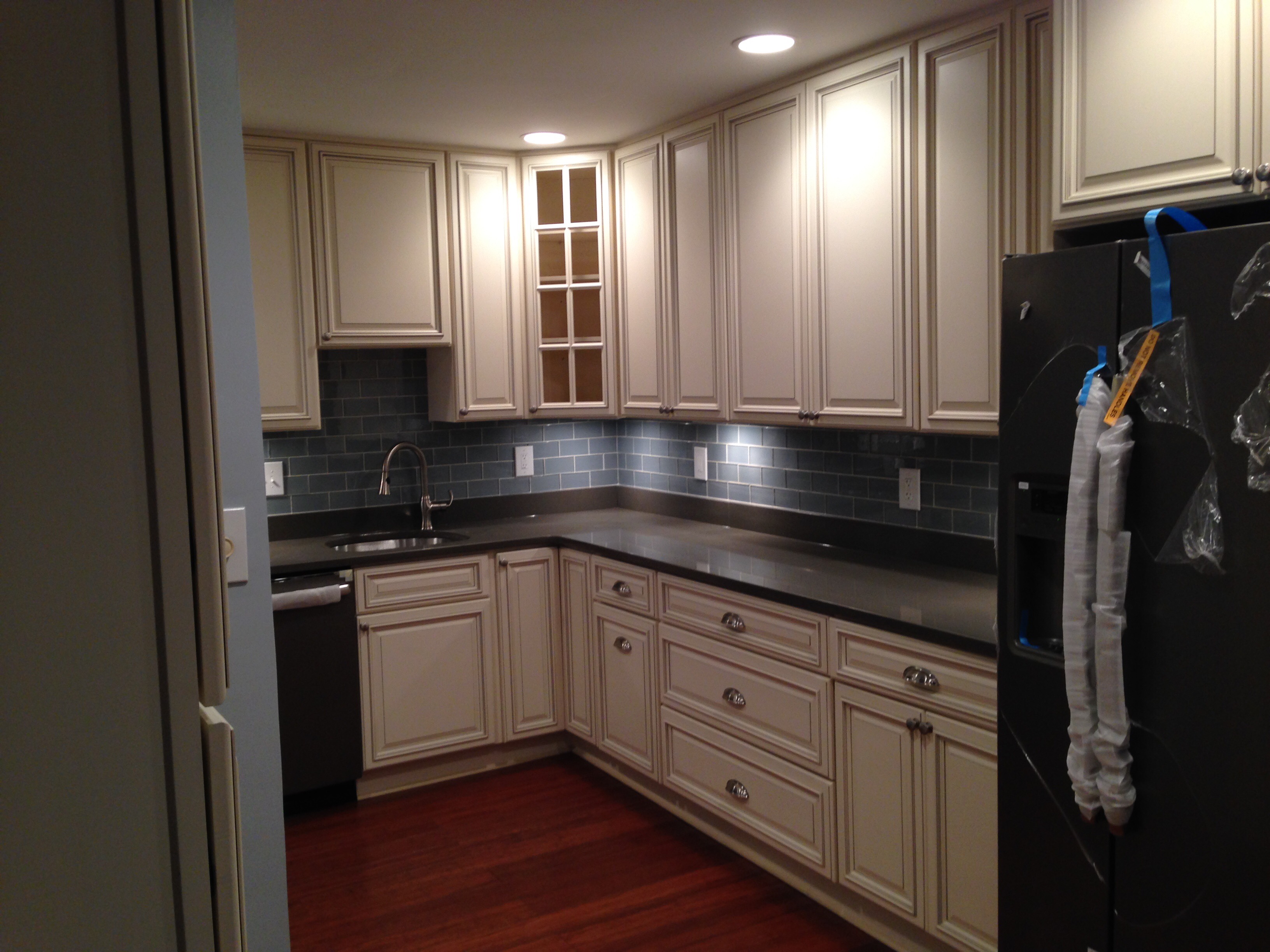
Kitchen reveal day!
February 21, 2015: After 26 days, the kitchen renovation is complete. The crew needs to come by tomorrow to do some touch up work with the paint and cabinet doors (couple missing knobs). But the cabinets are in. The appliances are in. The floor looks wonderful (although they feel a bit wavy…kind of like our feet are at sea…adding to KBR contractor follow-up before sign-off list).
The transformation is amazing. Check out my Kitchen Before post to see exactly what I mean.
I’ll do a Kitchen After post with pics of our “lived in” version of the space. In the meantime, here’s a quick rundown on the work that’s been done. V-
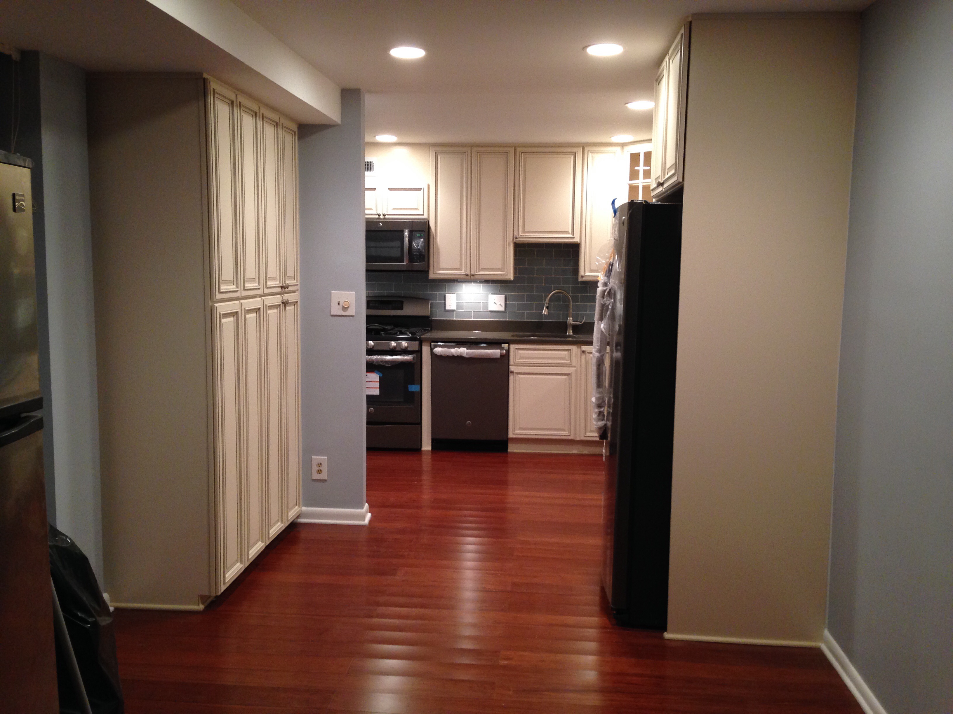
The space was opened up with a partial wall knockdown. You can see a the portion of the wall left standing on the left next to the pantry. That used to be a full wall with a doorway into the kitchen.
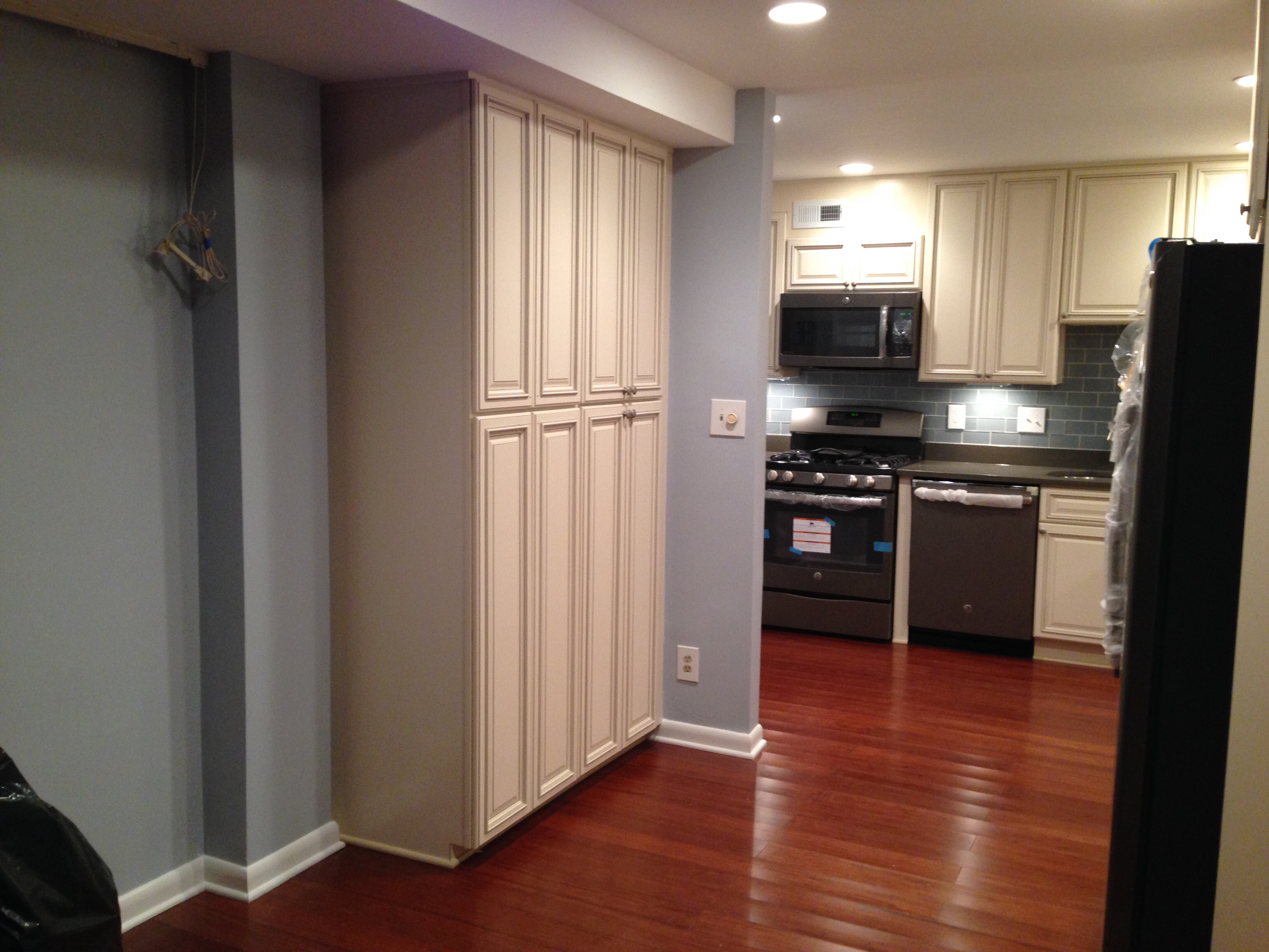
We decided to add a wall of cabinets for the pantry on the left. That space used th be first our dining area, and it later became my home office. We decided we needed storage more than a dinner table or desk for Davida…I’m happy to tap away on my laptop on the couch or at the kitchen counter.
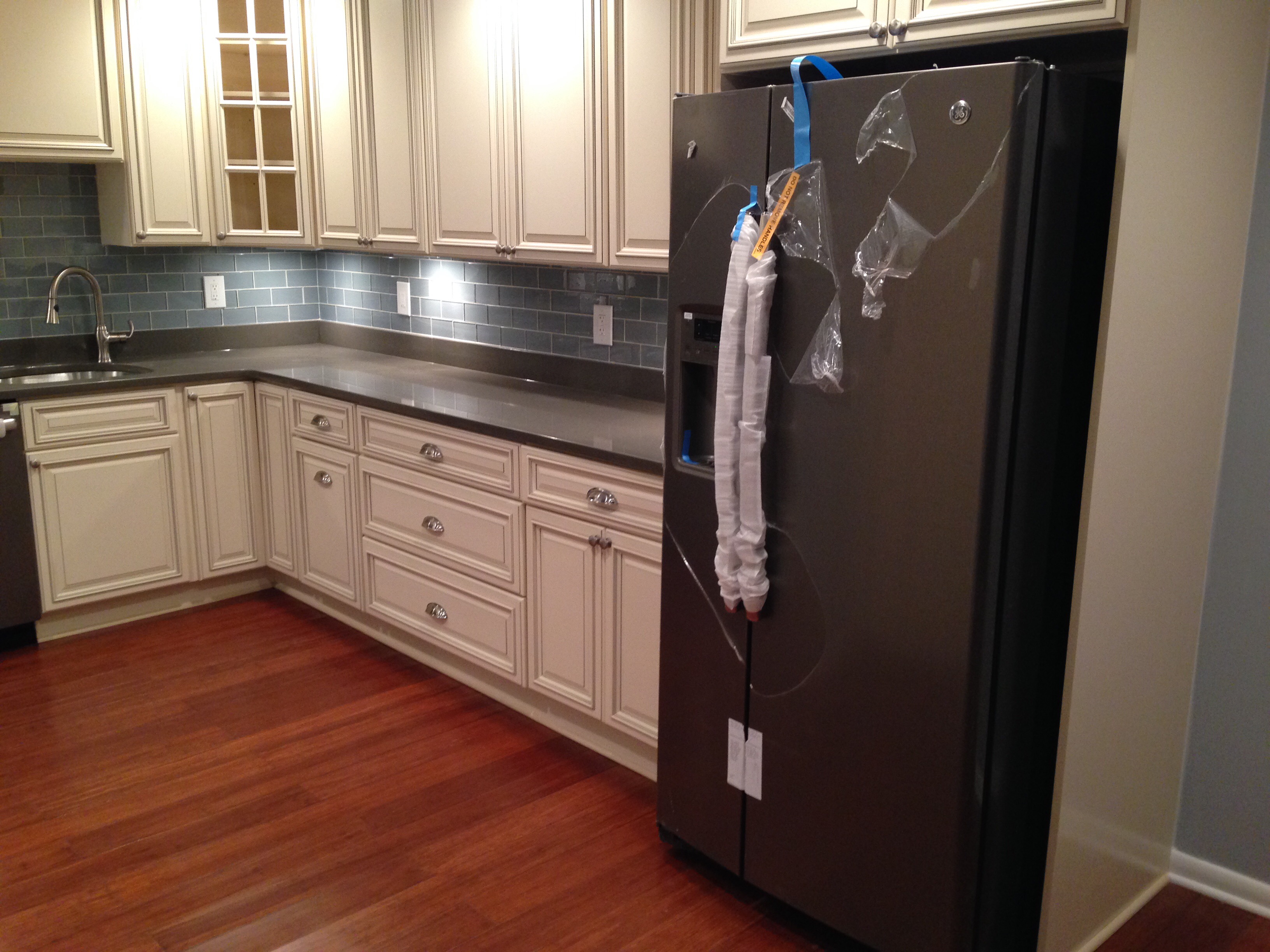
Here’s the new fridge! GE 22 cubic feet side-by -side slate model. This set us back a good $1500. It’s beautiful and looks perfect in our new, gleaming kitchen.
As you step in, you see the GE slate appliance family continues. We got the above oven mounted microwave, the high end gas range with self-cleaning convection oven. And, for us, a state-of-the-art slate GE dishwasher. In other words, it works!
The cabinets are Signature Pearl with the Silestone Altair dark grey quartz countertop. We got a glass door for the corner upper cabinet (which looks great!).
The backsplash is a glass dark blue/grey subway tile. The tile runs along the entire length of the cabinets and countertop.
We added recessed lighting in the kitchen ceiling and under-cabinet lighting as well.
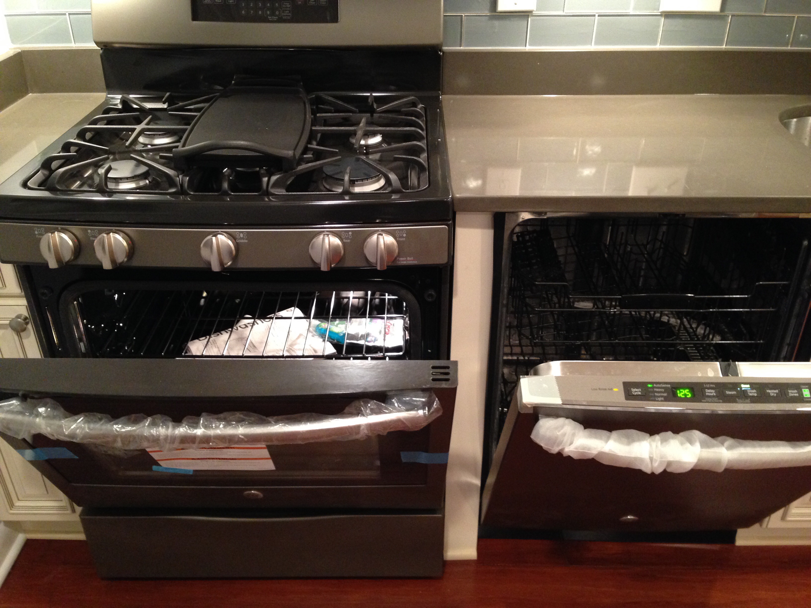
Sigh…a closer inspection of our brand new appliances. Pure heaven.
Here, the cabinet and counter space was expanded. In the old kitchen, the fridge was where you see the outlet now. Then you had the wall and the door.
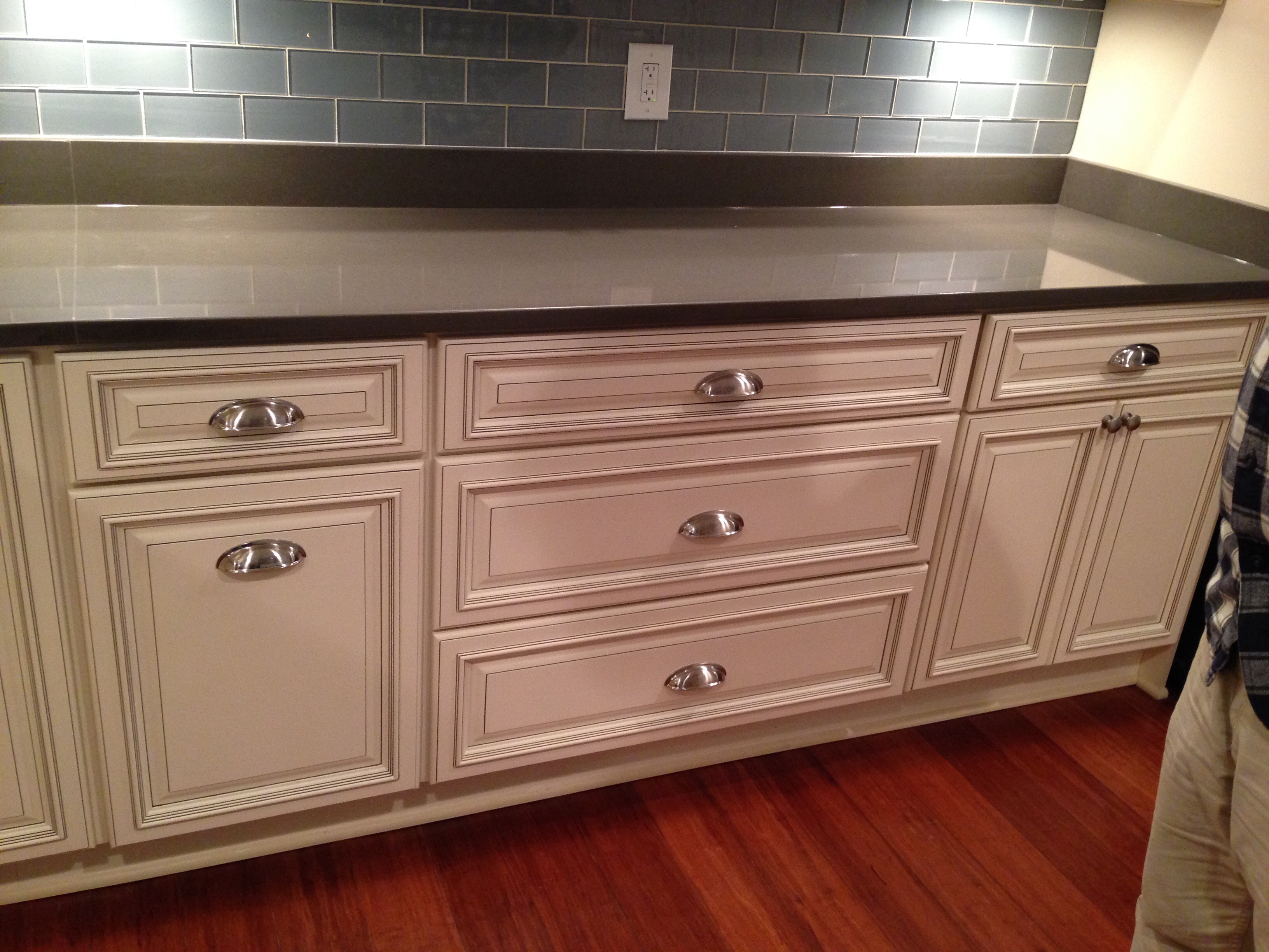
Here, since we knocked the wall down, we added a stack of 36″ cabinet drawers. And another 30″ cabinet with doors to the right. On the left we have a drawer at the top, and a pull-out trash and recycling bin cabinet (my absolute favorite one! I fought to have that added into the design plans and its here!).
Brushed nickle pulls were added to the drawers. Brush nickle knobs are on the doors.

Back right corner of the kitchen. The sink looks beautiful. It’s a very deep, D-shaped steel tub…perfect for dish stacking and washing.
Lovely outlet looking like high art against the tile. Thank you.
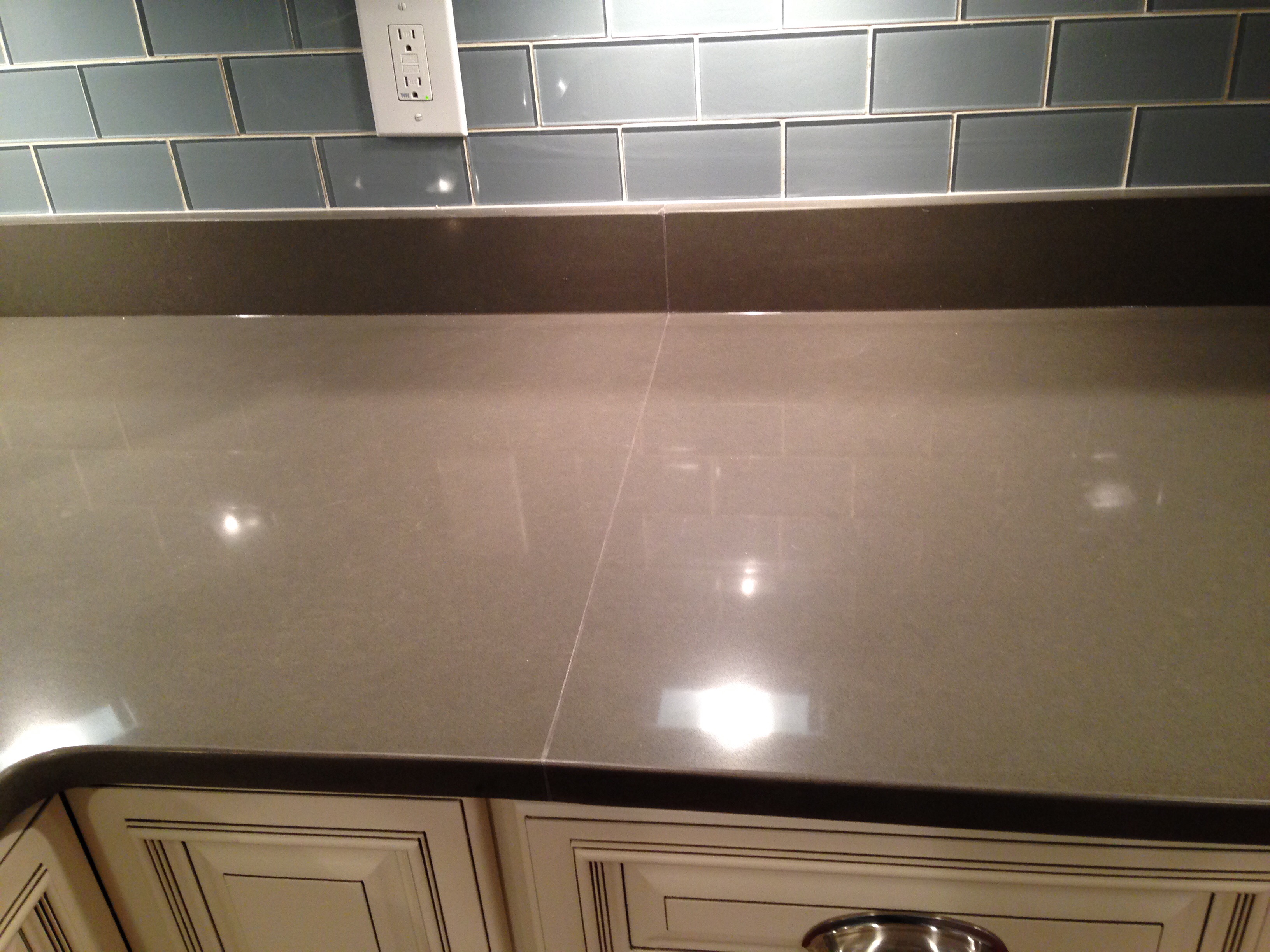
Gleaming Quartz cabinet.
A closer look at the gorgeous sink!
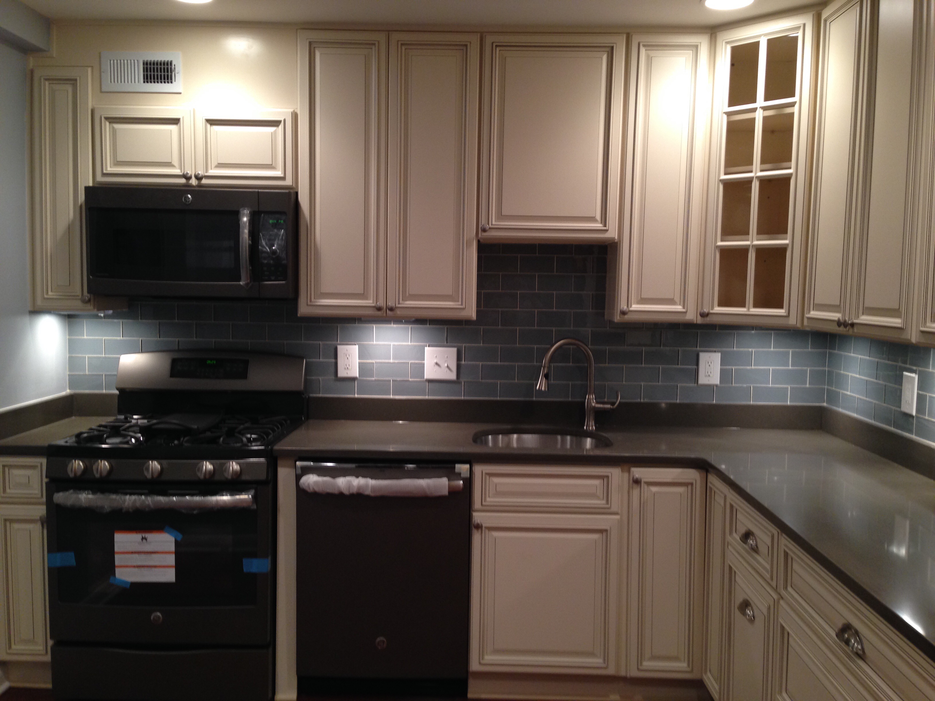
One final gaze at the gleaming new kitchen before we start filling the cabinets and drawers with our stuff! V-
